Humans have a limited attention span. This means that the content on your website must instantly inspire, please, and engage your target audience. As such, the “above the fold” content may not be engaging enough if you’re losing visitors and struggling to hold their attention.
You might need to redesign your website to organize your content better and feature the most appealing products up front. Most web designers concentrate their efforts on making a website look great, but if it isn’t engaging visitors, you won’t notice any real growth.
So let’s look at how you can optimize the section that you visitors see first and thereby generate more leads for local businesses.
What Is Above The Fold?
The area of your website that users see when they first arrive on a page is referred to as being “above the fold.” The header, text, image, or video that users can see without having to scroll down is referred to as the content above the fold. It should ideally explain what an organization does and the benefits that come with it.
Although the concept has grown more intricate with each passing year, the area above the fold still plays a significant role in website design. While it might not be as important as it once was, it still needs to be understood and taken into account by all websites that want to give their visitors an interesting experience.
What is “Above the Fold” in a website?
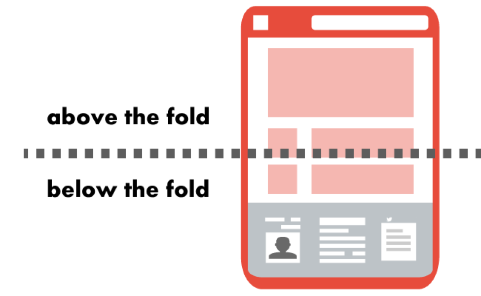
The fold, in simple terms, is where a user must scroll to view the content below the visible portion of the page when it first loads. Nevertheless, based on the device, it might become more precise.
Fortunately, there is a general guideline you can use: the fold line is roughly 1,000 pixels wide and 600 pixels tall. This can be useful for design, but it’s crucial to keep in mind that interesting content needs to be placed higher on the page and made more usable. It can direct user behavior and incentivize page scrolling.
Back in the 1970s and 80s, newspapers were folded in half so customers could only see the top half of the front page. The most eye-catching headlines had to go “above the fold,” to catch the eye of customers. And that is where this concept came into being.
Though it began long before websites even existed, it’s still a helpful benchmark for online marketing. The content a viewer sees before scrolling down on a website is referred to as being “above the fold.”
Why is “Above the Fold” so important?
Responsive to different screens
There are too many factors to definitively define the same fold across different platforms because there are so many different devices, screen sizes, and resolutions available.
Important content still needs to be prominently displayed on the page, but placement choices should take into account the smaller screen size.
How frequently people use mobile devices for web browsing is another factor to take into consideration when deciding where the fold should be placed.
Better design
The fold is ultimately a design principle used when creating web pages. Be skeptical of any advice that deals in absolutes because while it is necessary, how it is implemented varies. Don’t make things too complicated.
So that users know where to look first, keep your design simple. Also, make sure your content is search engine optimized (SEO). You’ll start to notice higher conversion rates if you do these things.
Improved metrics
Your website’s content that appears above the fold has a direct impact on your engagement metrics because it encourages users to explore the rest of the site and its content.
On the other hand, you’ll probably notice a rise in bounce rate and an improvement in conversions if it isn’t properly optimized.
A web page that is difficult to use, takes a long time to load, and is packed with information is unlikely to entice readers in the same way a page with the opposite design would. This may in turn negatively impact the ability to generate leads off the website.
Say you’ve been experiencing traffic decline. It’s possible that the information website visitors first encounter on your page isn’t compelling enough to draw them in and keep them there.
Visitors may find your page compelling once they begin to scroll, but if the content isn’t eye-catching and easy to use right away, they may choose to leave.
Above the Fold Website Design Best Practices
When you design your webpage, keep these practices in mind. They’ll keep visitors’ attention and encourage them to explore the rest of your website.
1. Maintain a simple banner design
If the content above the fold is overly busy, readers may not know where to look first and may leave the page. Alternately, if they can’t solve their problem right away, they’ll probably choose a different website.
Make sure it’s clean and includes a succinct headline that briefly summarizes your website followed by a sentence that describes it in more detail (aka blurb).
2. Include engaging content that resonates with visitors
Users should be able to read your header text and know exactly what problem you’ll solve. Your goal here is to show value to the consumer, and what better way than through a big, powerful statement on your landing page.
After you deliver your power statement, create an explanation that shows customers they’ve found the right place.
Your above-the-fold content should echo your brand voice, include a call to action, and utilize headlines and copy that delight your users. Keep it consistent and professional, and stick with a simple statement that summarizes how your product is their solution.
3. Include a strong call-to-action
Your website’s navigation should have a clear call to action (CTA) that is positioned in the top right corner. This should ideally be a button or link that people can click to take action (hence call to action).
A one- or two-sentence statement that positions your brand as the guide leading customers to a solution should go with the header.
4. Maintain a simple/clear navigation
Less is more when it comes to navigation. Your website’s layout should direct visitors in the exact direction you want them to go.
Keep your navigation clear and check that the menu bar directs visitors to key pages on your website, such as the offer’s description, the site’s about page, and a page with a contact form.
Keep your navigation bar to no more than 5-7 items as a general rule. You should also talk about your website’s capabilities and functionality.
5. Improve website accessibility and usability
Your content should be simple to interact with above all else. Make sure your above-the-fold content is functioning properly, for example, if you are working on the above-the-fold content for a product page.
Let’s say the above-the-fold content on your product page is a video. Are there options for sound, captions, and proper loading of the video?
Additionally, consider the user’s experience. Will a video that automatically plays in your above-the-fold content prevent users from interacting with the page? Make sure the video is playing silently and, if necessary, has subtitles to avoid this problem. Be sure to include additional web accessibility guidelines as well.
6. Above the fold on different devices
The information displayed on the visible screen without scrolling is displayed above the fold. Therefore, the location of the fold is determined by the size of the visitor’s screen.
There are a number of widely used resolutions, and not every visitor uses full-screen mode. The fold, however, is typically only 600 pixels high on phones and 1200 pixels high on the average desktop.
The width of the screen is one significant difference. Since a desktop screen is much wider than a mobile device, it is frequently possible to include the most crucial details in the image.
This formula is used by many popular websites: On a desktop, you display the most crucial content first; on a mobile device, you keep it simple and consider scrolling to be an inherent part of the page.