Given that mobile search goes hand in hand with local searches, it’s important that you learn how to make a mobile responsive website for local businesses.
Also considering that 61% of all Google searches are performed on mobile, you need to have websites optimized for mobile search. This is especially the case for local business websites.
According to SEO Clarity, if you rank in position #1 on mobile, it gets you 27.7% of the clicks, whereas ranking in position #1 on desktop gets you 19.3% of the clicks.
This article outlines some important tips to consider when optimizing a website for local search on mobile.
Importance of making a mobile responsive website
Let’s first look at why a mobile responsive website is important.
Simply put, if you want to rank on major search engines, such as Google, you must have your website mobile friendly. In fact, as of September 2020, Google announced that its bots will only crawl sites that are optimized for mobile use. If your site is not optimized for mobile visitors, it will not appear in search results.
For many years now, mobile friendliness has been a ranking factor in Google search results and according to Backlinko, it is among the highest impacting ranking factors and building mobile-first websites continues to be a trend in 2022.
More specifically for local business websites, “near me” searches on mobile have increased 250% since 2017. So it’s important that you incorporate your website to optimize for these searches in addition to other best practices mentioned below.
Best practices for developing a mobile friendly website
When you’re ready to dive into mobile optimization, search engine robots and user experience become your first priority. With these tips and recommendations, you’ll be able to easily make a mobile responsive website for local businesses.
- Optimize speed for seamless mobile experience
- Use a mobile responsive theme/website-builder
- Adopt a simple navigation menu
- Use Click-to-Call buttons
- Optimize positioning of CTA
- Avoid pop-ups for mobile viewing
- Compress images and optimize them
1. Provide a seamless mobile user experience
It’s important for local businesses to recognize how soon their end consumers will immediately switch to another site if they can’t find what they are looking for. Therefore, according to Google, it’s important that a seamless mobile experience is provided by:
- Making sure there’s no friction for users to take action, i.e. display click-to-call buttons, offer GPS-powered driving directions, feature one-click functionality to submit enquiries;
- Anticipating needs of the visitors by placing call-to-actions in prominent spots on the homepage and taking advantage of the built-in GPS capabilities of smartphones.
- Optimizing page load speed because users will easily abandon your site if it doesn’t load within 5 seconds. You can use Google’s PageSpeed Insights tool to check how well your site is performing.
2. Use a mobile responsive theme/website builder

Whether you are building a website on WordPress or any other website builder, you need to ensure that you choose a theme that is responsive to multiple devices.
Some themes have responsiveness in-built and it often contributes to a better user experience as well as provide SEO benefits.
This has become especially more important since more and more types of devices are created and screen sizes continue to change.
Some recommended mobile responsive WordPress themes that are highly rated are WPAstra and GeneratePress.
3. Adopt a simple navigation menu
Given that mobile screens are considerably smaller than computer screens, navigation menus must be changed to accommodate the smaller screen space.
Currently, the hamburger menu style has become popular on mobile websites. This style works well because it provides more screen space for other functions that serve to improve the user’s experience (i.e., social media links, images, etc.).
Another common problem on mobile sites is when there are simply too many links on a page. You can avoid this by removing unnecessary links from the navigation bar or moving them into tabs or drop-down menus.
4. Add Click-to-Call Buttons
Did you know that 60% of smartphone users have contacted a business directly using the “click to call” option (Source: ThinkWithGoogle). This goes to show that those websites that don’t add these buttons are missing out of valuable clicks from potential customers.
Adding click-to-call buttons is a great way to improve mobile user experience. They help increase conversions which in turn leads to more phone enquiries.
To add a click-to-call button, the easiest way is to either add the below HTML code:
<a href="tel:0XXXXXXXX">Call Me</a>where “0XXXXXXXX” will be replaced with the telephone number you want it connected to.
Alternatively, if you’re using a Button widget on a page builder, simply add
tel:0XXXXXXXXXto the area where you’ll enter the link.
5. Optimize positioning of CTA
As noted above, the spacing in a mobile screen is quite limited. So it’s important that you place greater emphasis on making the best use of this space. This is especially the case when positioning your call-to-actions (CTA).
Ensure that you follow the concept of the “thumb zone” – a term coined by Steven Hoober who defines it as “the most comfortable area for touch with one-handed use”.
In this context, you’ll basically include CTA at spots on the phone easiest for thumbs to reach and, consequently, most used by people (refer diagram below).
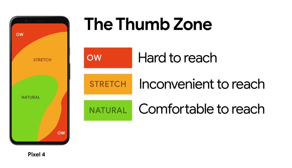
Also, according to the Gutenberg Principle, users will scan content from the top left corner of their devices and continue until they reach the bottom right corner. Scannable headlines and important calls to action are more likely to be picked up by users if they fall along this “Gravity” line.

6. Avoid pop-ups for mobile viewing
While we understand the importance of advertisements and pop-ups, we’ve found that it is not worth the risk. Unless you cannot absolutely do without it, it’s always best avoided.
If you are going to use a pop-up however, it needs to be simple for the user to close especially on a mobile device.
In the past, many websites used pop ups to deliver information to their visitors. However, a better alternative to a pop-up would be to include a CTA that leads to a landing page. At least this way, the visitors are not distracted while reading the content of your website.
7. Compress images and optimize them
Compressing images can help drastically improve page loading speed which is an important factor as noted above. Use a tool like TinyPNG that will reduce the file size of images.
Properly optimizing your images for tablet and mobile viewing (even for desktop viewers) will positively impact your website’s SEO, rankings, and user experience.
You could also consider using images that will adjust automatically based on screen size. This will ensure it will look great on any screen.
Here’s a simple CSS trick:
Did you know that you can use CSS property “max-width” to force images to fit into the size of the screen? Simply use
max-width: 100%(or a slightly smaller number like 98% or 95% if you want the image to have some margin.)
Final thoughts
The best practices mentioned above are ones that are widely accepted norms of creating a mobile responsive website for local businesses.
However, following them all doesn’t guarantee that the new website design really does work for your users. Therefore, it’s important that you test your new design with the target market and ensure the feedback is incorporated into the design.
Feedback can vary and be unique depending on the demography of the audience. So it’s really important that you select a focus group to test if the design works for them.